Redeveloping Yourself
Redeveloping Yourself
Turning our cool design into a functional site was going to be challenging. We wanted to use animation to showcase our interactive capabilities. First, however, we had to decide on the development platform.
We have a lot of experience developing sites in Drupal and Wordpress. Each platform has its strengths but, after some discussion, we settled on Drupal’s vast extensibility. We leveraged Drupal’s data structure, modules support, taxonomies, and views to build data-driven elements like our portfolio and customer testimonials. Once the core development was complete, it was time to tackle animation and interactivity.
Animation and Interactivity
Web browsers can now handle smoothly animating and interacting with HTML elements. We used native CSS styles to define most of the animation and JavaScript to manage the interactions. This ensured that both the animations and the intended interactivity could run on older smart devices like an iPhone 5 or 6 and older browsers like Internet Explorer 11.
We need a hero
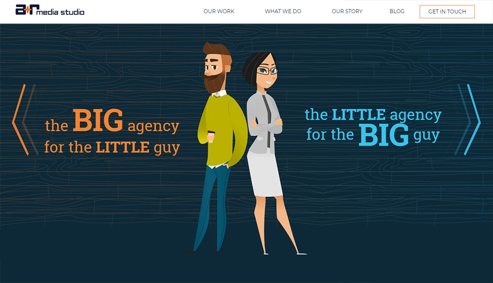
The bulk of the interactive development went toward our homepage hero, an interactive showcase of our capabilities. We used the same stylesheet/JavaScript techniques to navigate and animate most of the interactive and we kept all of the hero’s copy as SEO-friendly HTML text. However, this would not work as well for the largest animations. Their complexity and length would have made them impossible to produce using these techniques.
Flash to the rescue!
Luckily, we were able to leverage Adobe Animate (Flash) to solve our issues. Creating our larger animations using Flash made it easier to develop the animations and, more importantly, to make changes. We then exported the results as SVG code and used JavaScript to run it all. Even as SVG, these animations are still a lot for a handheld device to manage. So, the last piece was to use CSS to redirect everything through the device’s graphics processor instead of the main CPU. The results are a cool interactive with the same smooth experience on almost any phone, tablet, or browser.
Also, don't miss our first installment—Redesigning Yourself—where we talk about our site redesign process.


