Redesigning Yourself
Redesigning Yourself
By mid-2017, we really wanted to redesign our website. It wasn't that our old site was bad per se, but it was a bit outdated and no longer a reflection of how we wanted to position ourselves.
We decided that we would give ourselves the whole A+R treatment.
Now, we may have dealt with difficult clients before, but redesigning for yourself is an entirely different animal. First of all, all of our other clients' needs came first, so the biggest challenge was to accept that this process was going to take longer than we would like. In the end, time was exactly what we needed to develop a new site that focused on the kind of work we wanted to do.
The next challenge was to practice what we preached – to follow our own process. Here's how we did it:
Assess
The first step was to take a hard look at who we were and how we wanted to position ourselves. What kinds of projects brought us the most joy? What types of clients fulfilled our vision? Where did we fit in in our industry? Answering those questions gave us a roadmap for making many of the subsequent decisions.
Next, we needed to review our current assets and determine whether and how they could be leveraged into the new site. We decided to keep our logo. We evaluated our current portfolio pieces, keeping the ones that really showcased our range of talents. We reviewed all of the copy on our site and in our pitch materials to see what still worked.
The last step was to figure out our new site's architecture. This involved a lot of research and planning. What were the current trends for our industry? What would be the most effective organization of our content? How do we apply best UX/UI practices to our site? We created a site architecture map and page workflows, teeing us up to create the visual design.
Design
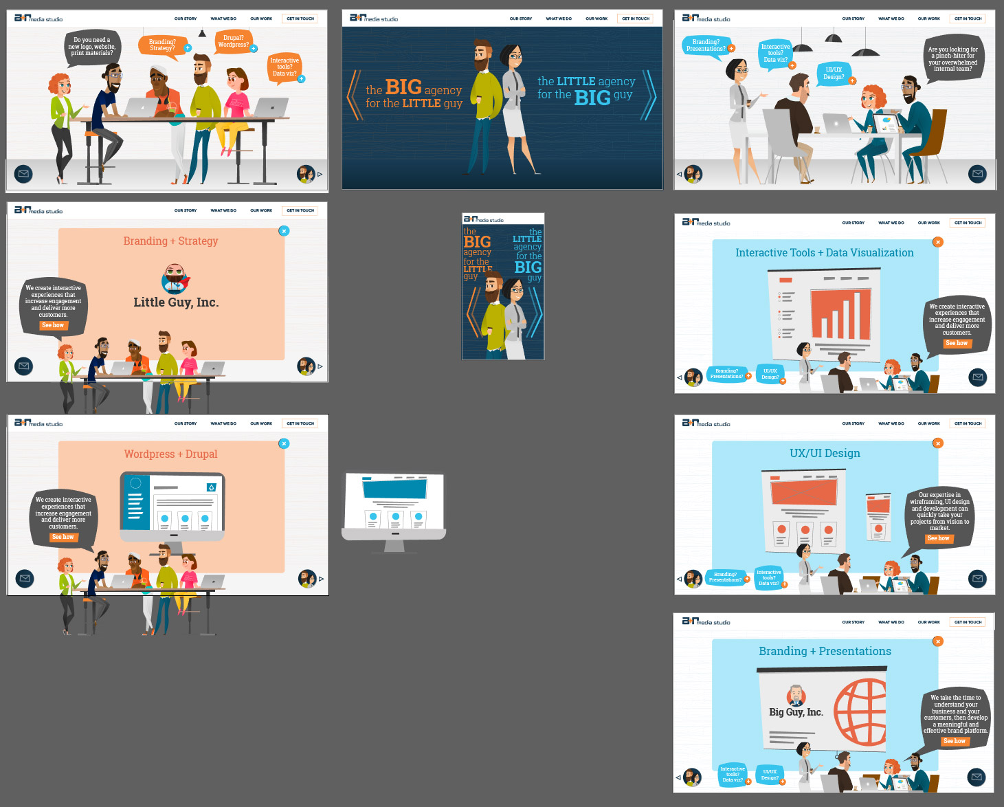
The goal was to define a style for the site that we thought would engage our visitors. Designing with yourself as the client is no picnic and we were definitely our own worst critics during this phase. I relied on the site architecture’s solid foundation to keep me focused, and a great partner in Rudy to keep me grounded. Most of the layouts came together quickly. The concept was a single page design with separate portfolio pages and a blog. The sticking point, however, was the homepage hero.
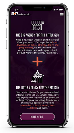
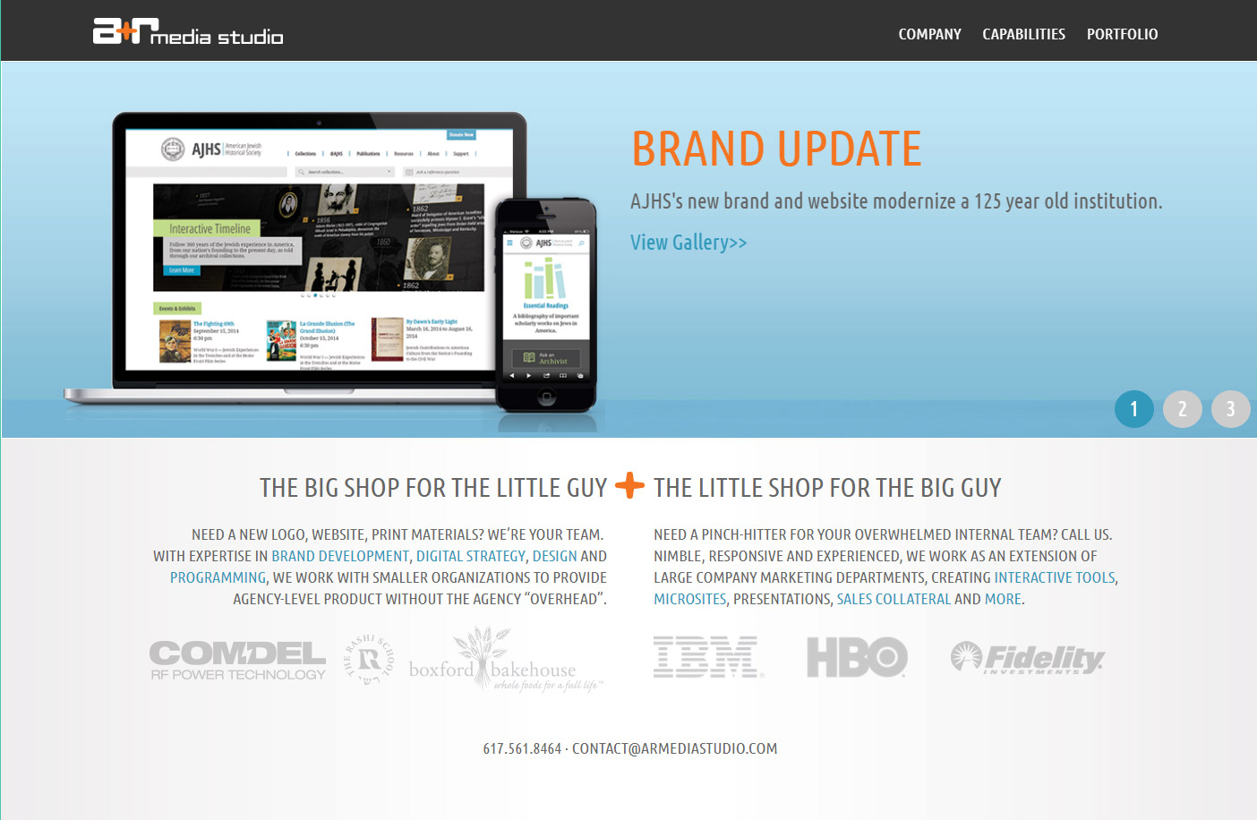
The hero is the first thing visitors see. If the hero does not engage them, they are bound to leave. The first design was a dark navy background with icons depicting a small company and a large company. Under each part of our tagline was a paragraph meant to speak to the potential client and their needs. It seemed OK on desktop, but we quickly learned that it was way too busy on mobile. So, we reassessed.
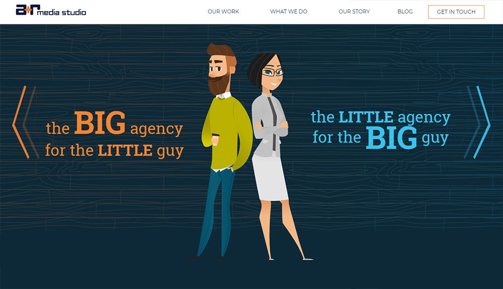
For the second hero design, we displayed the tagline over a custom background video that visually demonstrated the little guy/big guy theme and additional copy placed below the video. But something still wasn’t right. It didn’t feel like A+R. It didn’t express what made us unique. So, we reassessed.

For the third design, we asked ourselves, “What kinds of projects do we enjoy most and want to do more of?” That was easy -- interactives. Everything we love about the web is encapsulated in these projects: creativity, problem solving, user engagement, creating a narrative, animation, programming. We decided to do something we hadn’t seen many other agencies do – design the hero as an interactive story, a kind of “choose your own adventure” where we could offer a customized and engaging narrative about our services.
That was it! We were really excited about our site again! But this was a lot of work we were signing up for – with a lot of risk attached. Would people get it? Would they find it interesting? How long would it take? We knew we had to move forward with our new plan and hope that by being true to ourselves we could create a site that both delighted and informed our visitors.
We spent time finalizing the concept and reviewed again to confirm that the user actions were accessible, purposeful, and intuitive. We created storyboards to document the intended interactive experience.
Everything was finally ready to hand over to development and production. But, that’s a story for the next post.