Every December and January, there are a bounty of blogs highlighting upcoming trends for the year. UI design is no different. I typically peruse a dozen or so of these “Top UI Trends for This Year” pieces to get a feel for where the digital design zeitgeist is headed. One recent design trend caught my eye – Glassmorphism. Sounds pretty fancy, right?
Glassmorphism a combination of a few different CSS styles that produce a look similar to panes of frosted glass. The name was coined by Michael Malewicz in November of 2020 to better define this UI style apart from similar concepts like blurred backgrounds or more general layer opacity effects. Since then, the term—and the style—has been gaining in populatirty, enough to make it to a bunch of “UI Trends” listicles.
In his blog post Glassmorphism in user interfaces, Malewicz highlights the key characteristics of this style:
- Layer transparency
- Use of background blur
- Multi-layered elements floating in space
- Vivid background colors that highlight the blur and transparency
- A slight border on the semi-transparent layers
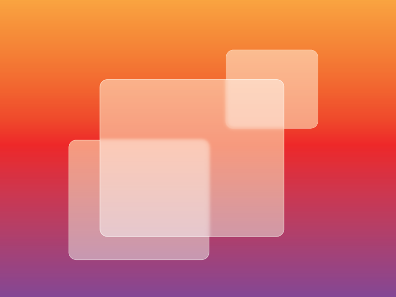
Here’s an example of Glassmorphism in action:
If you’ve worked in web design and development as long as we have, you tend to see design styles repeat themselves. I’ve certainly seen versions of this style in the past, but achieved via image creation or Flash animation. What I like about Glassmorphism is 1) how you can easily achieve the effect with CSS styles (no graphics necessary) and 2) how it updates and combines several different visual styles into a semi-realistic and fresh-looking application.
There’s only a handful of CSS styles needed to achieve this effect:
- Create a background with some interest to it – a gradient, a picture, or some graphic elements. Try not to make it too busy though.
- Create a div with a white background, set with some level of opacity
- Add a background blur
- Add a thin border around the div
Here’s the CSS behind it
.bg-grad	{
	position: relative;
	width: 100%;
	height: 400px;
	background: rgb(131,58,180);
	background: linear-gradient(90deg, rgba(131,58,180,1) 11%, rgba(253,29,29,1) 66%, rgba(252,176,69,1) 100%);
	}

.glass {
	background: rgba( 255, 255, 255, 0.45 );
	box-shadow: 0 8px 32px 0 rgba( 31, 38, 135, 0.37 );
	backdrop-filter: blur( 6px );
	-webkit-backdrop-filter: blur( 6px );
	border: 1px solid rgba( 255, 255, 255, 0.3 );
	}

.one	{
	position: absolute;
	top: 50px;
	left: 30%;
	width: 40%;
	height: 250px;
	z-index: 1;
	border-radius: 10px;
	}

.two	{
	position: absolute;
	top: 80px;
	left: 60%;
	width: 20%;
	height: 150px;
	z-index: 2;
	border-radius: 10px;
	}

.three	{
	position: absolute;
	top: 130px;
	left: 20%;
	width: 25%;
	height: 200px;
	z-index: 3;
	border-radius: 10px;
	}
A quick word about compatibility. According to Can I Use… The Property “backdrop-filter” which is used to create the blurring effect behind your shape, is fully supported by the latest versions of Chrome, Safari, iOS, Android browser and Edge. It is not yet supported by Firefox, but you can enable in on the user end.
Glassmorphism Resources
If you’d like to try your hand at creating Glassmorphism effects in your design, there are a few resources that can help: