9 Tips for Creating an Email Newsletter
9 Tips for Creating an Email Newsletter
Email newsletters are a great way to keep in touch with your clients and customers. In fact, 83 percent of B2B companies use enewsletters as part of their content marketing program (Imaginepub.com, 2017) and 40 percent of them say email newsletters are most critical to their content marketing success (Content Marketing Institute, 2017).
For years, we resisted creating our own newsletter. There were plenty of excuses—it took too much time, we had plenty of work, we didn't know what we could say—you name it. But, we knew how valuable enewsletters were because we created them for our clients. So when we decided to relaunch our website last year, we added an enewsletter to our marketing strategy. If you'd like to check it out, you can subscribe to our newsletter here.
Below are our 9 tips for creating your own email newsletter. The tips range from strategic to practical to technical to help you get started.
1. Define Your Strategy
The first step in crafting a newsletter strategy is to figure out your newsletter's purpose and what you hope to get out of it. Start off by asking these questions:
- Who is my audience and what type of newsletter would they appreciate?
Your audience will likely be current and potential customers or clients. For retail businesses, the newsletter may focus more on new items, promotions, or exclusive access to sales or products. For consultants the focus could be more on thought leadership, general updates or exclusive content like ebooks or white papers. - How do I want to be perceived by my audience?
As an insightful marketer? An appreciative seller to my customers? An engaging collaborator? Think about what you want the overall impact of the newsletter to be for you and your business. - What actions do I want my audience to take from this newsletter?
For a retailer it may be that you want people to take advantage of a sale or increase brand loyalty. Other organizations may want to promote new offerings or inform people about events. For consultants it may be fostering a reputation of expertise in their field or keeping themselves top-of-mind with their audience. - How frequently do I want to send a newsletter?
You'll need to find a balance between what your market and audience expects and your bandwidth in order to produce compelling content on a recurring basis. For example, we’ve found that a monthly newsletter works best for us – enough frequency to remain engaged with our subscribers while giving us enough time to plan for and create content.
Once you’ve answered the questions above, write down all the things you could offer in a newsletter. Then review it critically to see where you can pare down and refine. Why? Because at this stage, most of us will be overly confident in our ability to generate newsletter-worthy content so try to focus on core offerings that you can realistically accomplish on an ongoing basis.
2. Give It a Name
Now that you know what kind of newsletter you’re producing, it’s time to give it a name. Naming your newsletter will help set it apart from other email communications you may be sending. It’s also an opportunity to inform your audience and set expectations about your newsletter’s content. Choose something that is inviting and easy to remember. Also consider mentioning the frequency in the name or tagline. Here are a few examples:
- Medium Daily Digest
- Disney Fans Insider
- Food & Wine’s – “The Dish”
- Crunch Gym’s “The Bench Press”
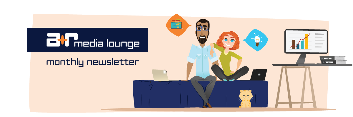
We decided to call our newslatter, “A+R Media Lounge” and included “Monthly Newsletter” as our tagline. The concept for the “lounge” was to convey a relaxed, conversational feel that was approachable and creative.
3. Map Out Your Newsletter’s Content Architecture
How you structure your newsletter is dependent on a number of factors, so you’ll want to map out the basic content architecture before you begin building your template.
Persistent Elements
These areas are part of your newsletter template and would remain the same for every issue.
- Header: the header of your newsletter includes your company or newsletter name/logo, any artwork associated with the newsletter itself, plus any external navigation links to pages on your website.
- Footer: your footer may include links to your website and social media properties, a link to the user’s subscription preferences (e.g. an unsubscribe link), and the physical address of your business.
Newsletter Content
The body of your newsletter will be crafted for each issue. Your content will vary depending on your communication strategy. For the A+R Lounge, we mapped out a content architecture that included:
- Intro paragraph – greets the subscriber and provides a quick explanation of what’s in the issue
- Feature Discussion – thought leadership on a chosen marketing/design/development topic
- On the Blog – link to a recent blog post that relates to the feature discussion
- Pro Tip – additional insight or action the reader could take relating to the feature discussion
- On A+R – a personal photo and update on what’s happening with us
- About the Lounge – brief description of the origin of the newsletter with a call to action to connect with us.
4. Make Your Content “Snackable”
This content is a legit snack!
A few months ago, I came across a great article on Neil Patel's blog called "How to Create Mobile Friendly Content," where he discusses content formatting based on a "bite, snack, and meal approach" and breaking up your content into "snackable" chunks that make content easier to scan on mobile—and desktop for that matter.
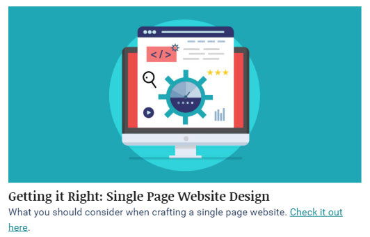
Though the focus of the article was mobile web content, the same concept applies to newsletter design. Rather than trying to fit everything into the newsletter, instead offer several smaller chunks of information with links to the full article, post or webpage—think Image + Headline + Summary.
5. Use a Responsive Template
Mobile opens accounted for 46 percent of all email opens. (Litmus.com, 2018)
Responsive means that the email's layout adjusts to the device it is viewed on – desktops, tablets or phones. Responsive templates contain device-targeting styles that optimize the display of your email content.
Most email marketing platforms like MailChimp, Constant Contact or Hubspot have a selection of pre-made newsletter templates to choose from and offer ways to modify those templates to match your branding or message. You should ALWAYS choose the responsive template for your communications.
6. Know what works and what doesn’t across email clients
Not all email clients handle HTML the same way, and few of them are as robust in HTML and CSS rendering as current web browsers. To avoid a lot of headaches later, understand what you can and cannot do in different email clients.
For example, I designed a rounded-corner button for a recent email campaign, implemented with CSS. However, Microsoft Outlook on desktop doesn’t recognize the CSS properties that create rounded corners, so it displayed the button as a rectangle:
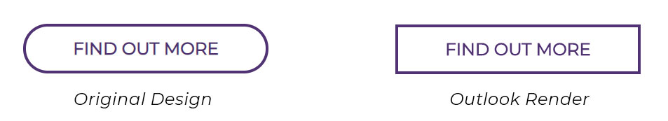
I knew this going in and felt it was an acceptable trade-off. However, there may be instances where the difference in how email clients render HTML or CSS will be unacceptable. Check out the resource Can I Use in HTML Emails to learn more about CSS support in HTML emails.
7. Optimize Your Images
I am an evangelist for proper image optimization. Optimizing images means that the image is at the correct size for its purpose with the smallest file size possible while still retaining image quality. You can learn more about proper image optimization in my post Image Optimization for Print and Web.
Image optimization is critical for HTML emails. Here are some tips to make the best use of images in your newsletter:
- Reduce File size: overly large images will slow downloading times and could make the difference between a user reading your email newsletter or deleting it. The total weight of all images should not exceed 800K.
- Optimize for mobile: Remember when I recommended that you use a responsive template? Well, most of the time the code in your template will resize images to the full width of your mobile device screen. In addition, retina displays allow for twice as much detail than regular desktop monitors. You should plan for this by sizing images at 2x the pixel width of mobile – which is usually around 600px. Aim for 1200px wide for images and use CSS styles to appropriately resize images for their containers.
- Plan for accessibility and blocked images. Many email clients have images turned off as a default. Make sure important information or calls-to-action are text, NOT part of your image. Use an image’s "alt" attribute to describe its content.
8. Test, Test, Test
The first test for your new email is to send it to yourself. When you receive this test, be sure to check these things:
- Is the subject line updated and free of typos?
- Is the pre-header text updated and free of typos?
- Does the overall display of the email match the intended design?
- Does the text format properly (fonts, sizes, alignment)?
- Is all content grammatically correct and free of typos?
- Do all links work as intended?
- Is there appropriate “alt” text for every image?
- Is there an unsubscribe option and is it working properly?
- Did you include social media links?
- Is your physical address part of the footer?
Once you fix any issues from your initial test, it’s time for broader device and platform tests. Since there are so many devices and email applications out there, your best bet is to use a service like Litmus or Email on Acid to test a wide range of options. Your chosen email marketing platform may also have a testing function. These applications will take your email code and render it on several different devices and mail clients, such as Apple, Android, desktop, Outlook, Gmail, Apple Mail, etc. Scan each of these test renders critically and look for any display errors.
9. Don’t forget about the text version
The text version of your email is exactly what you think – a simple email that contains only the text without any images or formatting. The plain text version of your email serves a few important functions. First, it increases accessibility by being screen-reader friendly. It serves as a backup for email clients that cannot render HTML. Lastly, the text version may increase the deliverability of your emails as HTML emails without a plain text companion can get flagged as spam.
Most email platforms will generate a plain text version of your HTML email for you, but it’s important to review this version and adjust any issues like line breaks or weird spacing so the plain text experience is as thoughtful as the designed version.
Conclusion
Starting an email newsletter may seem like a daunting task, but following these tips with help you plan and execute great newsletters.